
Nike+ Running App Redesign
FALL 2016
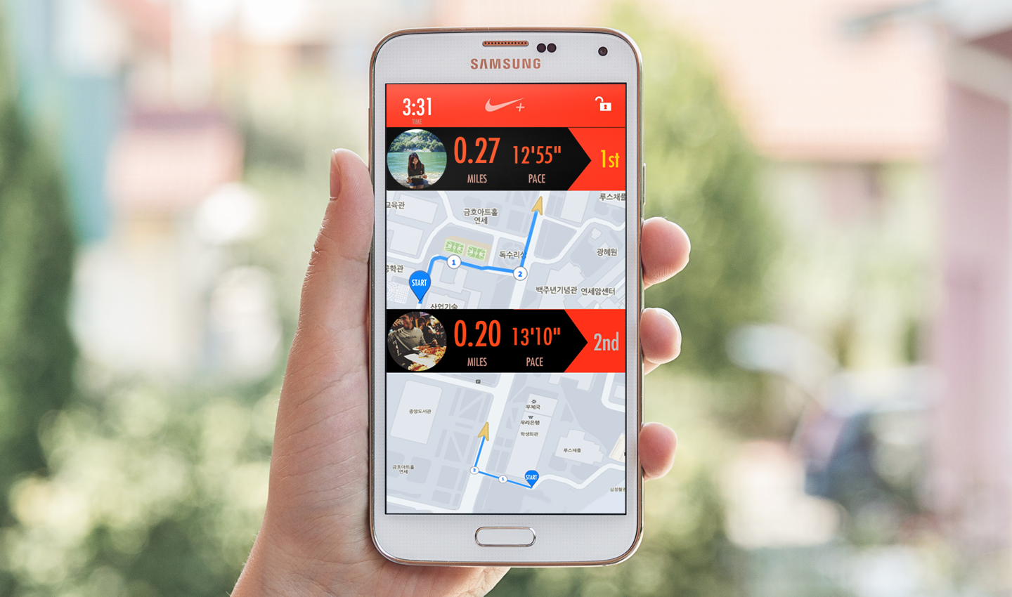
The Nike+ Running application is a phone application designed to help track and motivate runners while on their runs. It’s there to help runners know exactly how much they’ve run, where they’ve run, and to motivate runners with challenges and awards. My role was to identify the pain points users had with the application and to remedy those pain points through prototypes.
Tools: Pen and paper, Adobe Photoshop CS5, Invision
View Invision Prototype
- Fix the existing application’s heuristic violations
- Redesign the interface to make it easier to use
- Add additional features that would most motivate users to use the application
- Paper prototype ideas and tested these prototypes on users to iterate upon the usability flaws found
- Created high fidelity prototypes on Photoshop
- Made prototypes interactive on Invision and tested on users
- Tools Used: Pen and paper, Adobe Photoshop CS5, Invsion
Task Analysis
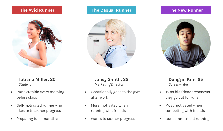
First, we made sure that the Nike+ app was indeed in need of improvement. We did an initial evaluation of the heuristic violations as a team. I then interviewed a couple of users about running applications in general as well as getting them to try the Nike+ app to see if they had similar pain points that I found. After solidifying that this was indeed a problem, I created three user personae and scenarios based on my findings from the user interviews.
In the end, we decided to take on these four main tasks:
- Improve the overall usability of the application by fixing heuristic violations
- Create a more intuitive graph of running improvements
- Create a more socially encouraging running app
A more detailed process of our task analysis can be found HERE.
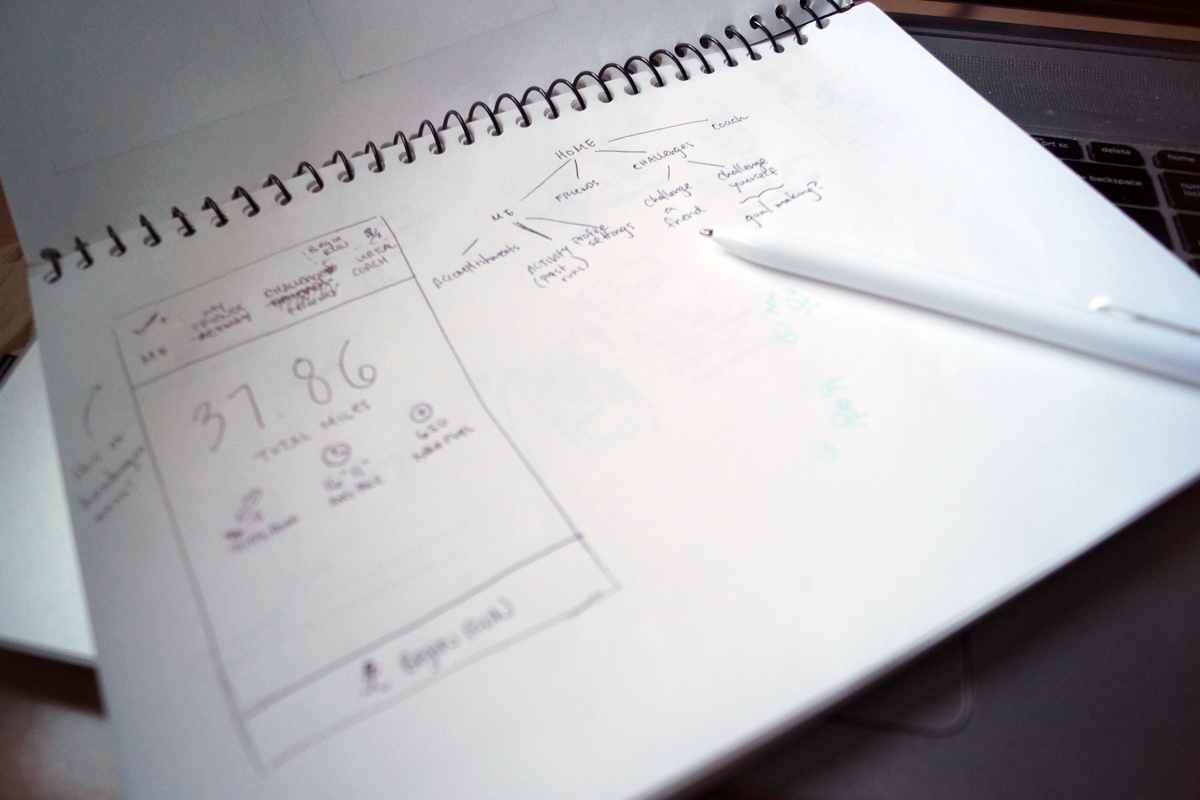
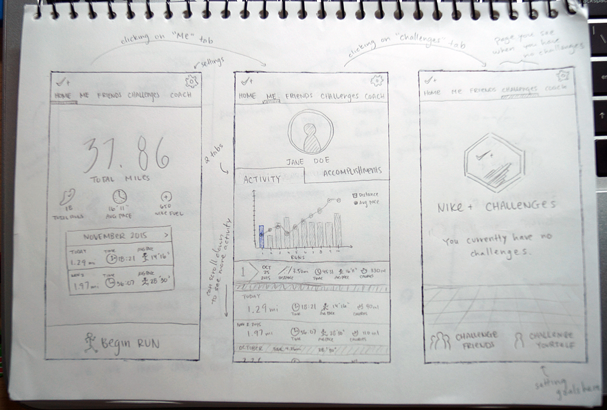
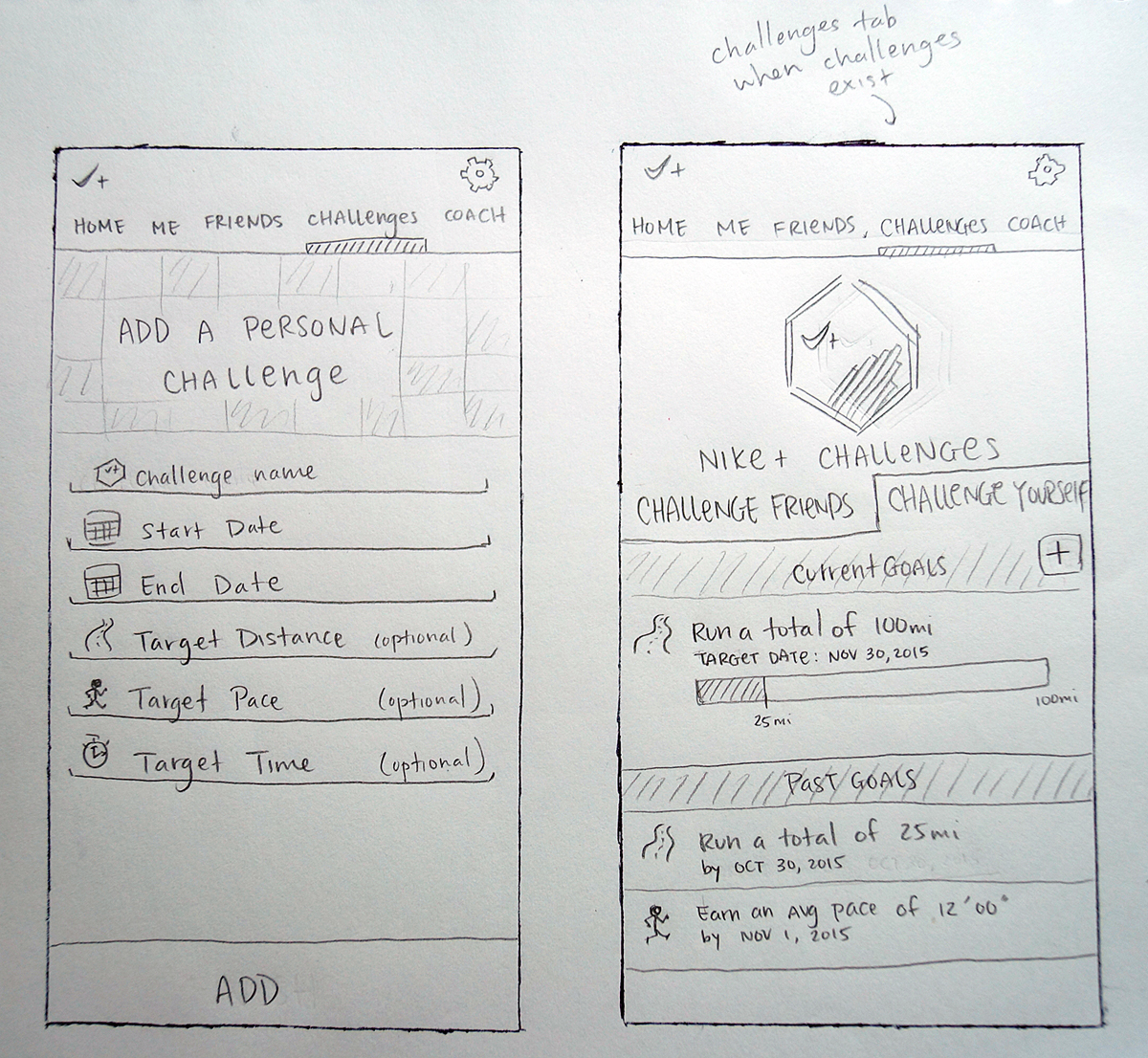
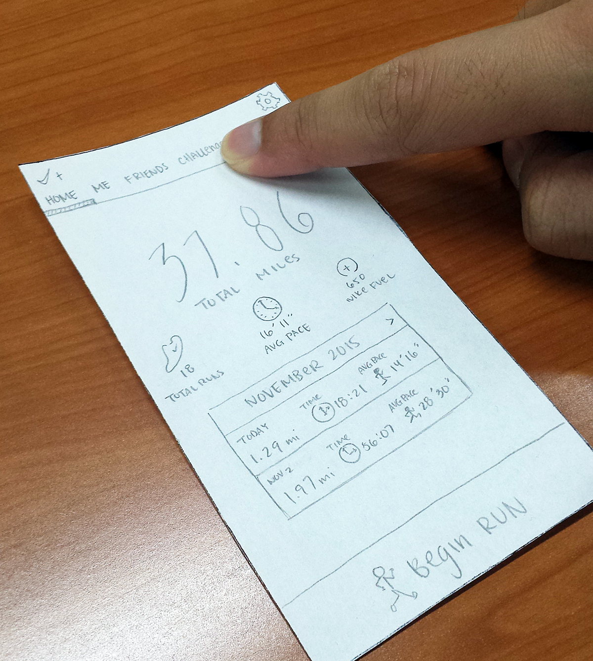
Low Fidelity Prototype
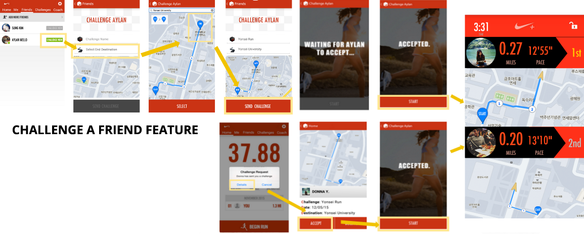
I proceeded to create paper prototypes modelling the main functionalities we’ll be adding to the Nike+ Running App: allowing the user to better view their progress/improvements and the ability to challenge a friend to a run. In addition to that, I made slight heuristic improvements along the way.
Storyboards
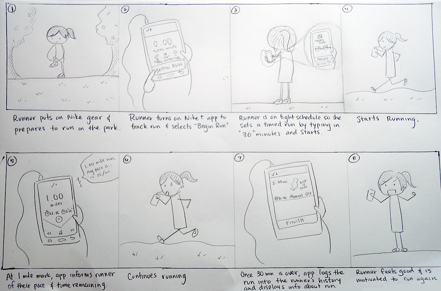
Scenario: “Basic Run”
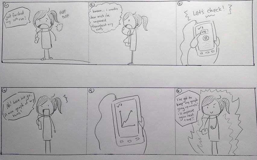
Scenario: “Check Improvements”
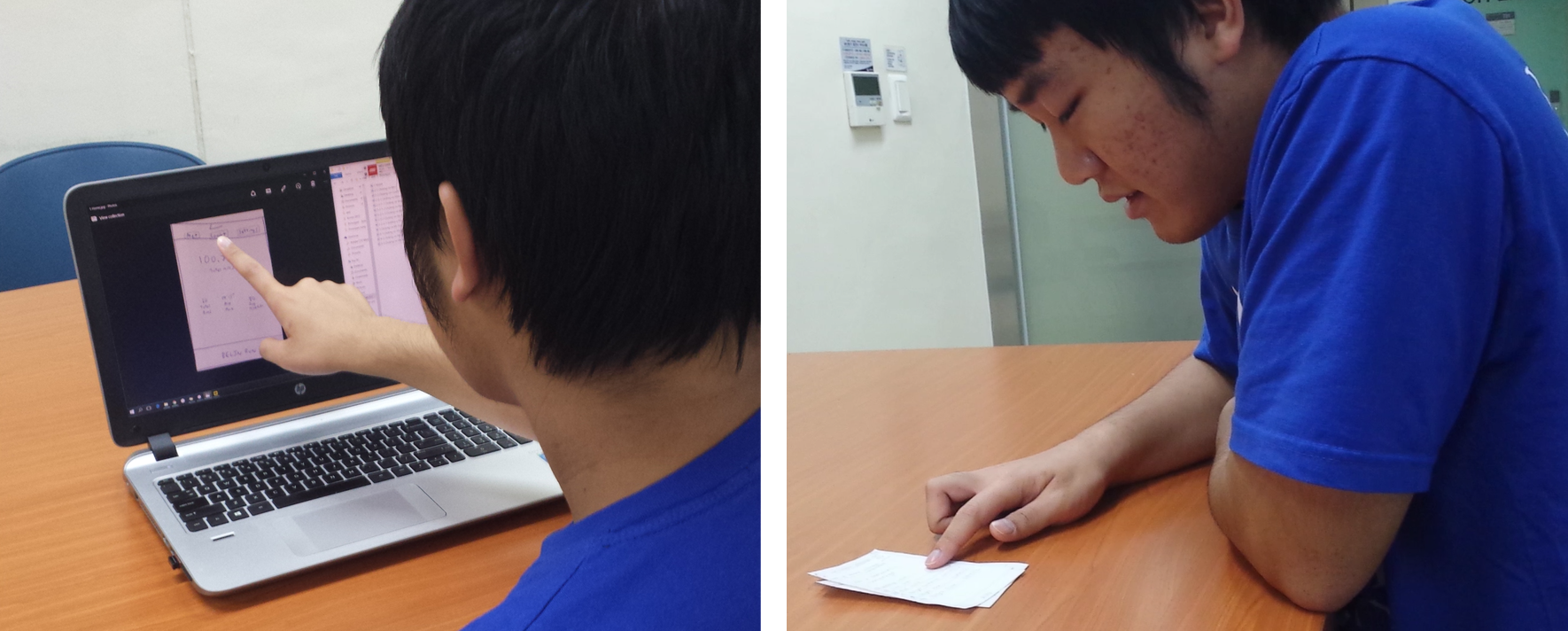
User Testing
We tested our prototypes on a total of 3 users, all of which are some type of runner (our target audience). In my user testing, I first let the user familiarize himself with the original Nike+ app. Then I showed him my prototype and asked him to act out the scenarios I modelled above in my storyboards. I also had him test our brand new "Challenge a Friend" feature.
A more in depth look of our low-fi user testing process can be found HERE.
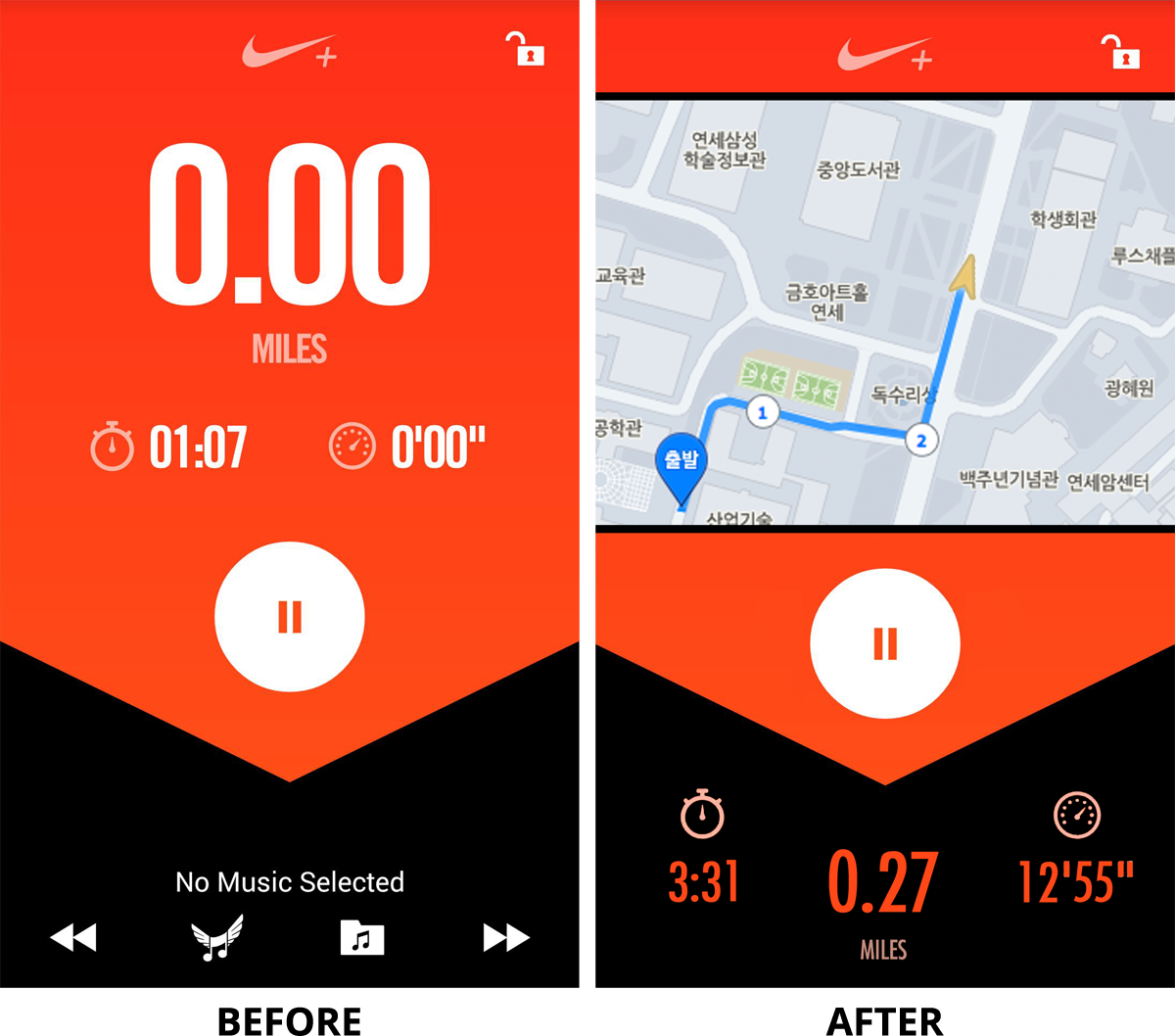
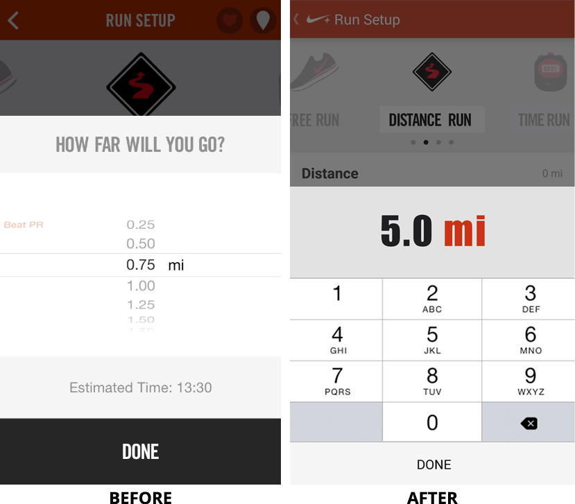
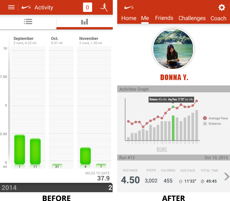
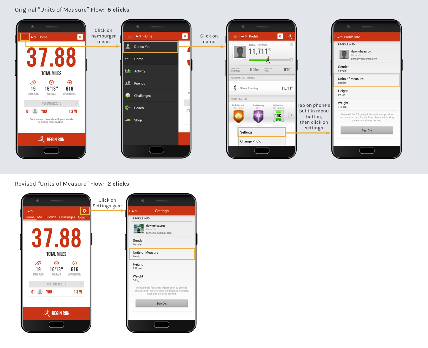
Final Prototype — Before vs After
Final Video Ad
Learnings Recap
It was a good experience going through a structured six stage design process including: project proposal, task analysis, low-fidelity prototype, rapid prototype, heuristic evaluation and video prototype to modify and create our Nike+ 2.0 version of the application. We went through multiple iterations of evaluation, design, and implementation to build a more user-centric and intuitive design of the application.
I constantly kept the user’s wants and needs in mind while redesigning this application and I really enjoyed getting some of my foreign friends to help me with my user testing. It was interesting to see how different their thought process was from mine. Because there were many time constraints, I do regret not being able to deliver more quality prototypes.